THE GRID
One of the chief uses for a grid is to keep your design elements aligned and ordered, and your page design clean and neat. This is because grids encourage alignment, that part of their purpose. A grid system establishes a set structure to align elements, such as images, columns, picture captions, logos, page numbers, and more.
Using a grid helps you you create a neat, clean, and organized layout that looks professional. Grids speed up and improve your design time, as they act as a guide to signal where to place, position, and scale elements in the best place.
The article resource files are at the link here:
LINK TO DOWNLOAD RESOURCE FILES
The supplied In-Design Template available on Google Classroom and here:
LINK TO DOWLOAD THE INDESIGN TEMPLATE
Choose three (3) different layouts to work with.
You may use the same topic for all three layouts executing different designs,
or you can create three separate layouts with three different topics.
• Grids keep content organized
• They make your job quicker
• Your type will thank you
• Collaborating with other designers will be much easier
• Balancing your design will be significantly easier
• Grids enhance your visual hierarchy
• Grids resist cluttered looking layouts
• Designs are more visually pleasing
• Grids can help you design on diagonals
• Grids encourage the use of white space
THE ASSIGNMENT
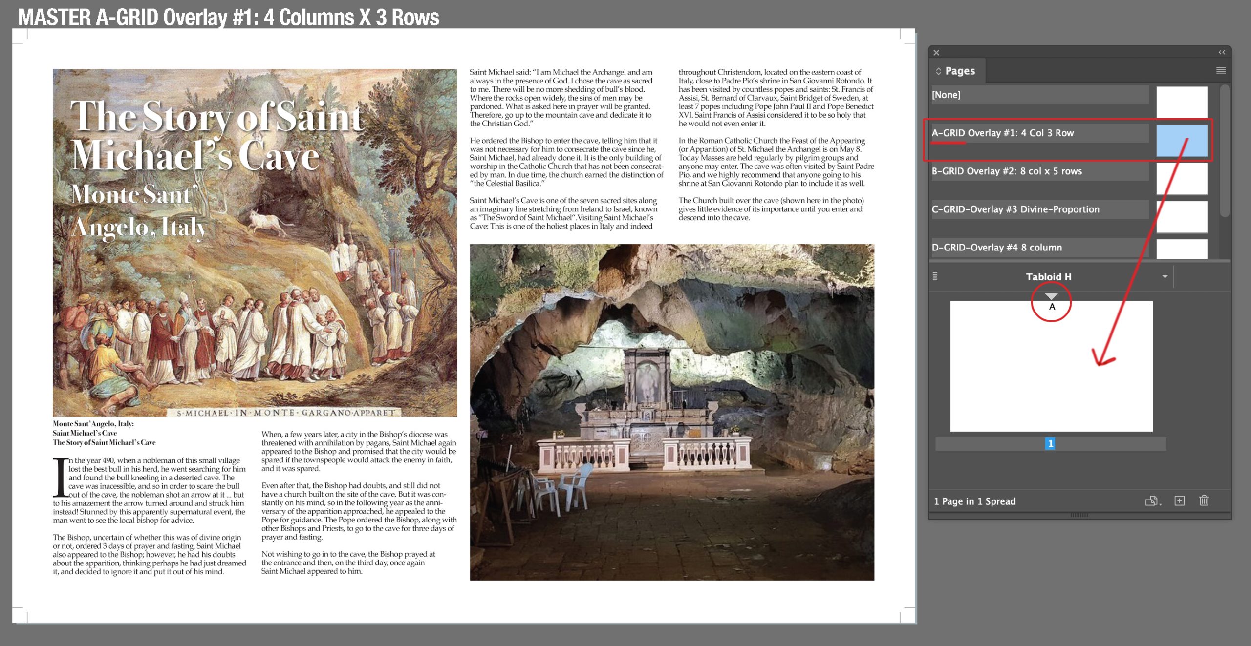
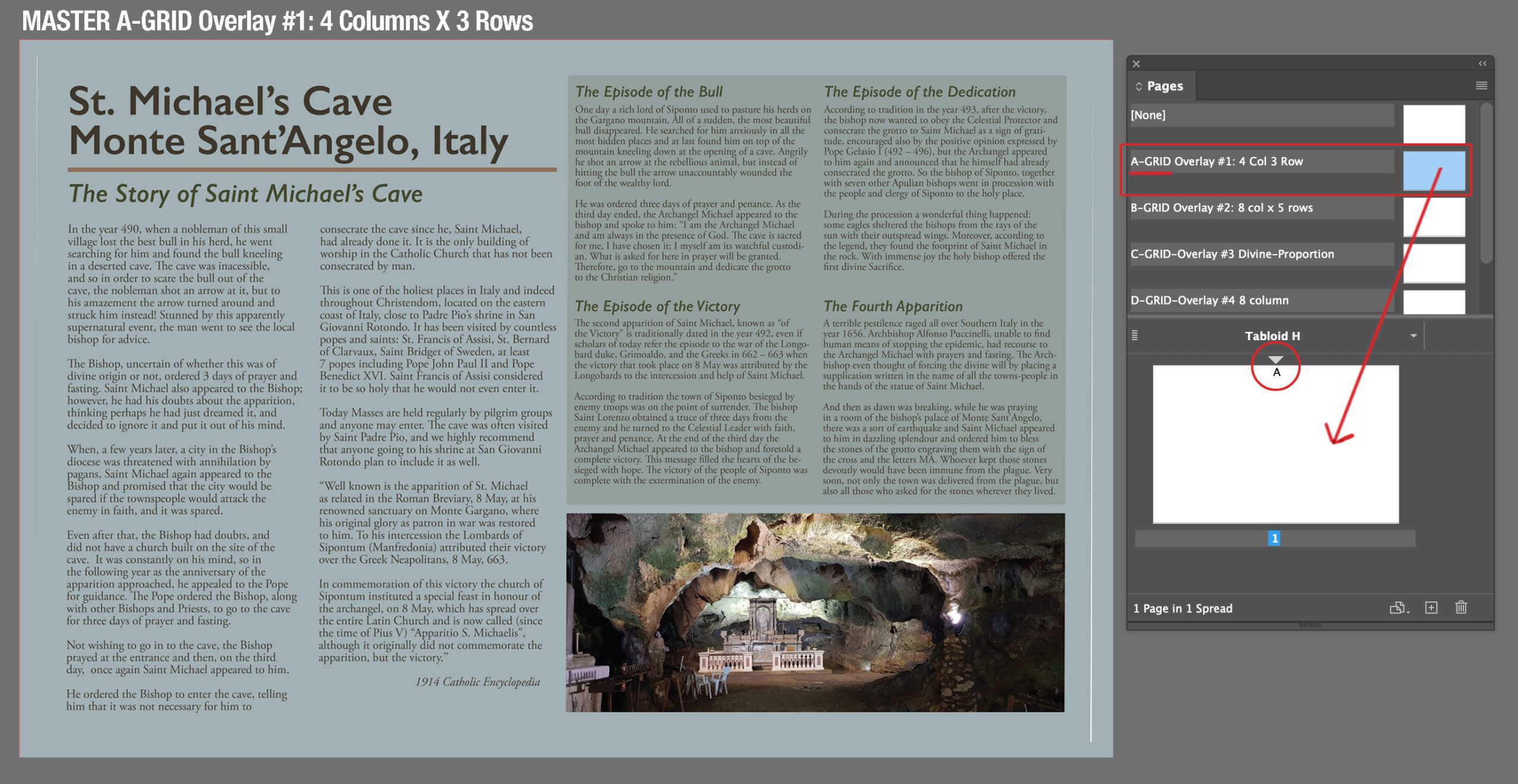
The supplied In-Design template 17″ wide x 11″ high with a .25″ bleed, tabloid size has (5) MASTER PAGES in the template containing integrated grids within the master that will display on your page. The grid will not print, but will help you develop your layout on the spread. Use the supplied text and images in the subfolder located in the GRID FOLDER named Resource_Articles. The object of this exercise is to focus on creating engaging layouts using the grid as your underlying structure. So the text has been supplied to eliminate the time required for research. Choose from the variety of supplied topics. You can use other photos if you would like to find others that match the story.
Develop layouts using (3) DIFFERENT GRIDS from the 5 supplied grid configurations.
You may either use the same topic for all three layouts executing different designs
— OR— You can create three separate layouts with three different topics.
TEXT: You must edit the copy supplied. Some of the copy is provided in a PDF file — this could happen in the real world. You will have to open the PDF in Adobe Pro and click on the EDIT icon to enable your cursor to pick up and copy the text into your In Design file. You will also have to do some “copy fitting” with your paragraphs.
TYPE HIERARCHY: Create headlines and subheads using different type styles (bold, heavy, italic, etc.) or by using color or color blocking.
You can choose to use the supplied images or find your own on the subject.
– Create three (3) separate layouts using the supplied template.
– All three design layouts need to be in ONE (1) In-Design Document.
– At least (1) layout must use JUSTIFIED text.
– Select NO MORE than two (2) typefaces for each spread (page/layout).
Remember the rule of thumb for pairing fonts: Serif with San Serif works best. Don’t mix same type styles.
Think about using two dimensional shapes, or blocks to anchor text, or display information in interesting ways. Remember you can reverse out text and use color to add emphasis on important information. Also remember to develop a style for any picture captions.
FIRST: Configure your InDesign Menu
Arrange the following menus on your right-hand menu bar for easy access with this program.
After you have set the icons in place, save this as a CUSTOM WORKSPACE.
Make your menu custom: WINDOW/WORKSPACE/NEW WORKSPACE
Type your name into the input box.
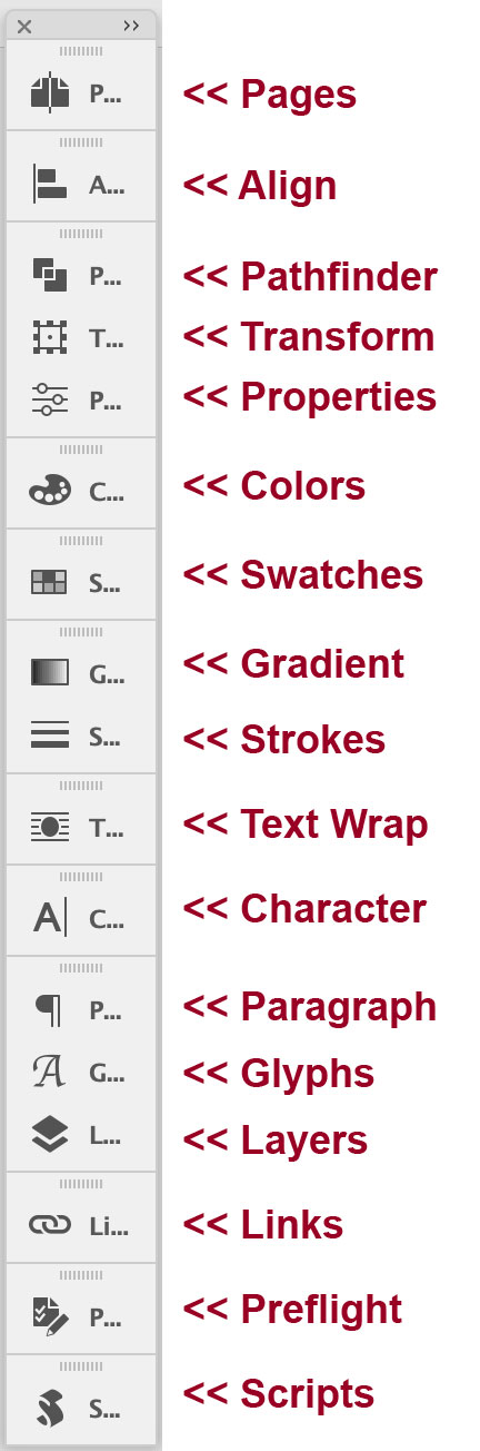
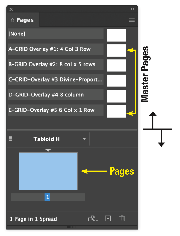
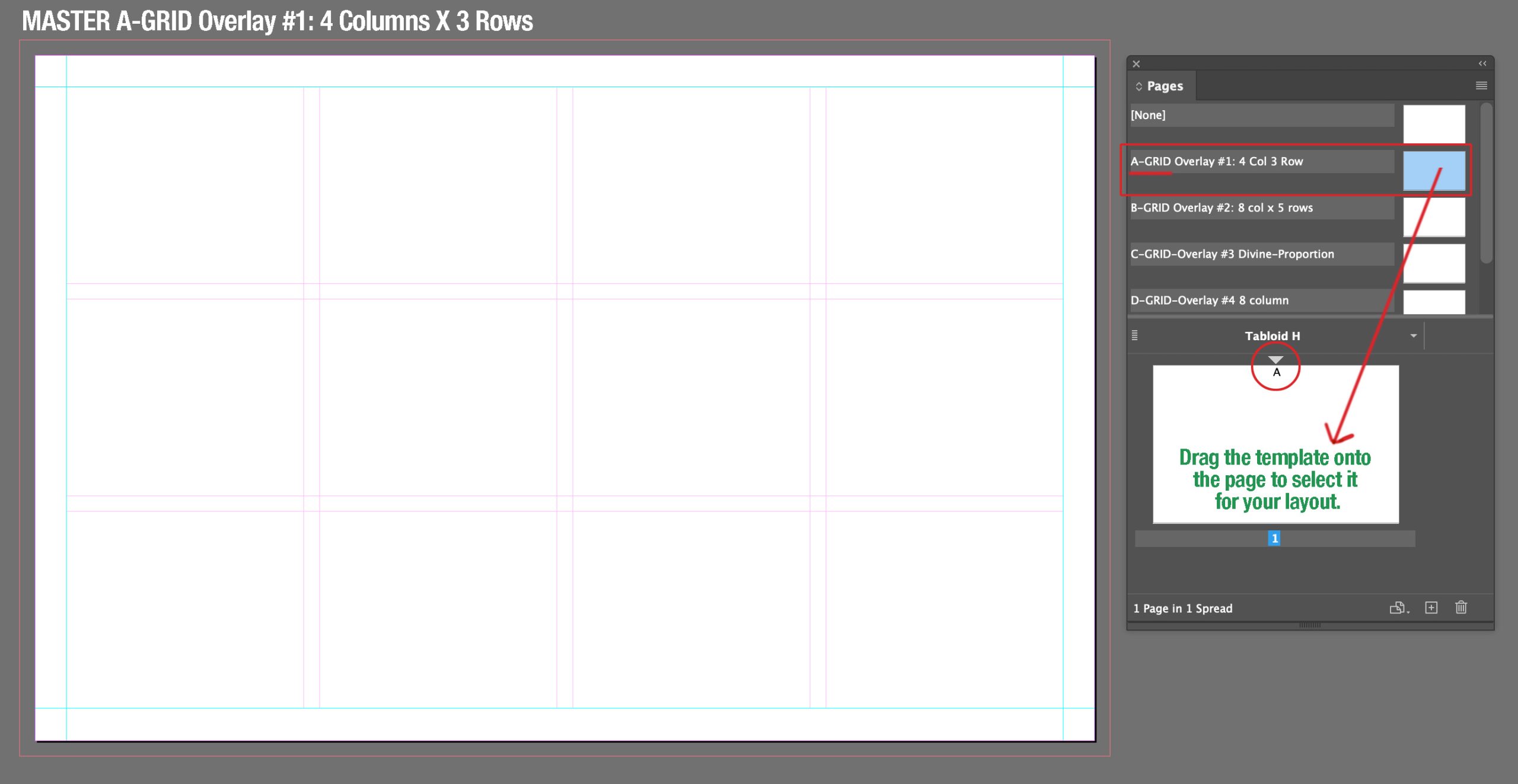
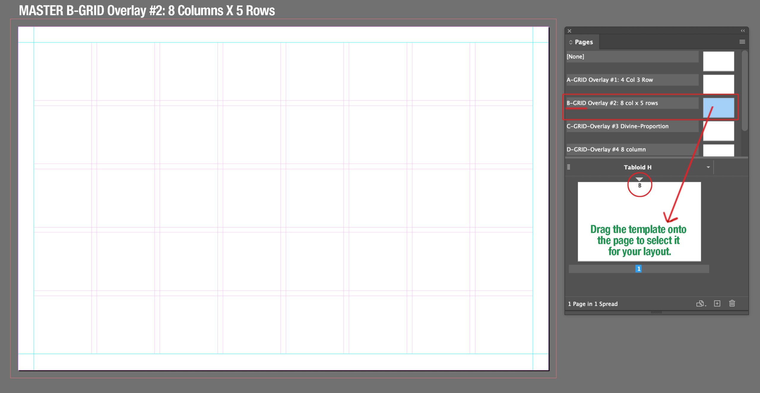
The PAGES MENU
PAGES MENU: Your MASTER PAGES sit above the dividing line.
You can move this line up and down to view the masters.
 Notice that there are 6 Masters. The top master is the default and is labeled NONE. It would give you a totally blank page. Each of the other masters have a grid provided to use for this project. |
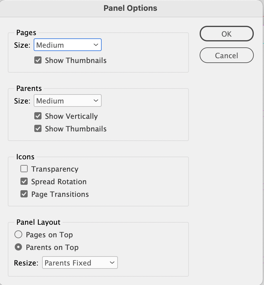
You can adjust the size of the icons in the PAGES MENU |
Choose 3 out of the 5 templates to use for this project.
ALL 3 designs need to be in 1 document.
To add a page in InDesign:
– Click on the hamburger menu on the top right hand corner of the PAGES MENU.
– Select INSERT PAGES. Type in 2 in the Pages field and change the drop down menu for Insert to At End of Document
– Click the OK button.
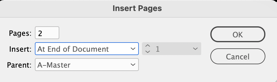
Note: You can click on the dropdown menu in the Parent field to choose a different master here, or you can change the page master by clicking in the master window (located above your page window) and drag any template onto a page in the pages menu to change the master for that page.
The Layers Menu
| There are two existing layers set up for you in this template. The top layer is labelled >Grid Overlay. Notice that the text is italicized and that the layer is locked, but visible.Your artwork goes on the bottom layer labelled Artwork. This layer is visible and UNLOCKED. You can add other layers if you need to, but don’t delete the top Grid-Overlay layer. 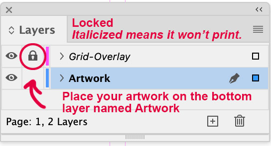 You can turn the Grid-Overlay visibility on and off by clicking on the eye while you are composing your layout. You can turn the Grid-Overlay visibility on and off by clicking on the eye while you are composing your layout. |
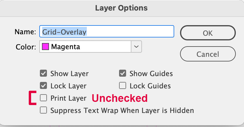
If you double click on the Grid-Overlay layer you will see that the Print Layer box is UNCHECKED. This means that the grid will not render out when you save your file as a PDF for printing.
|
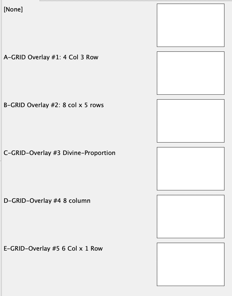
The Choice of Grids
 |
 |
 |
 |
 |
The Grids with Student Examples
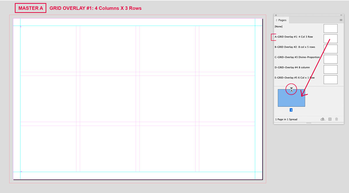
Grid A: 4 Columns, 3 Rows
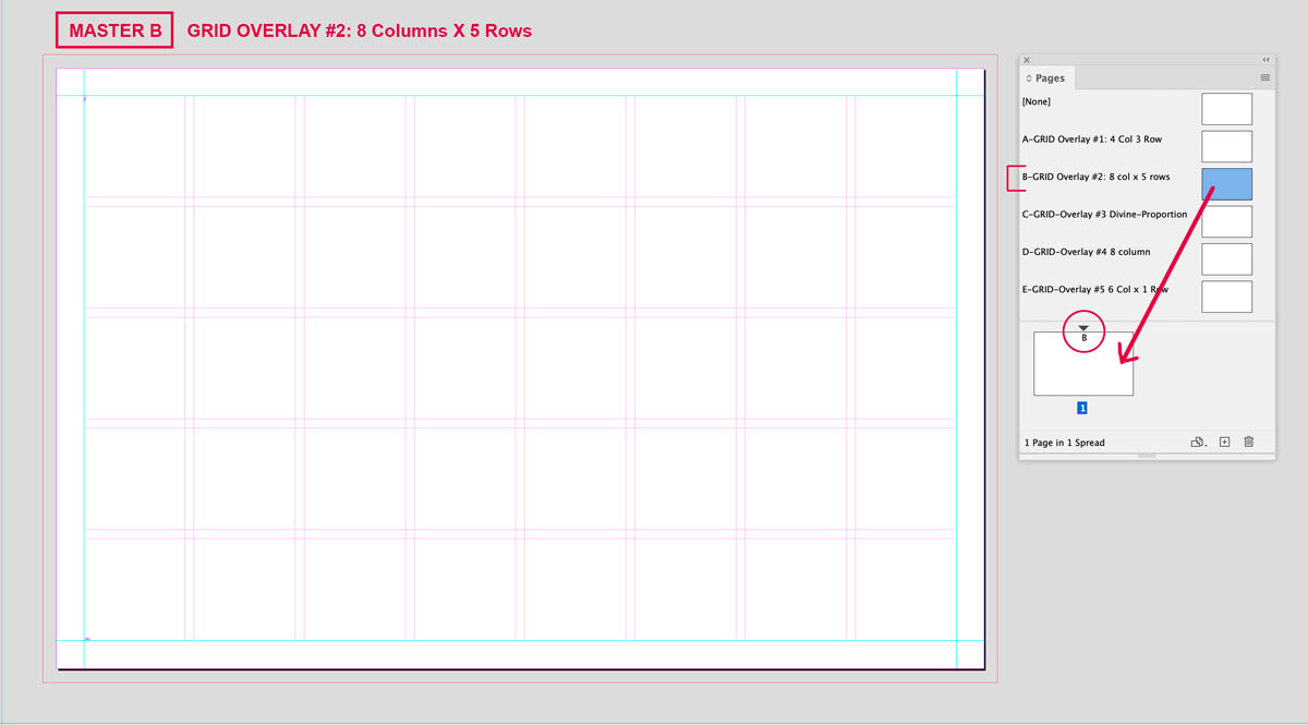
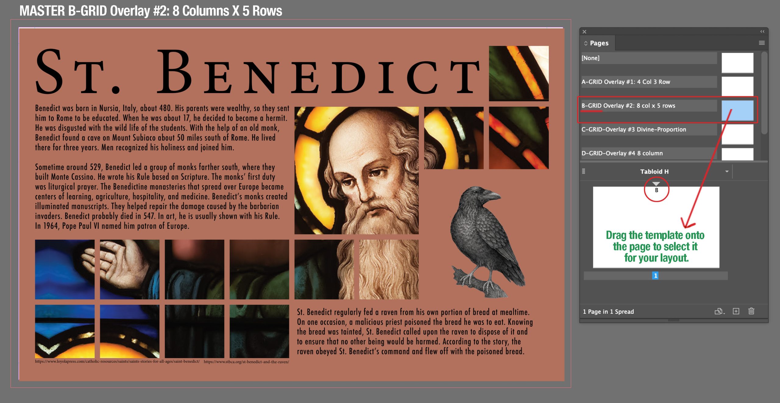
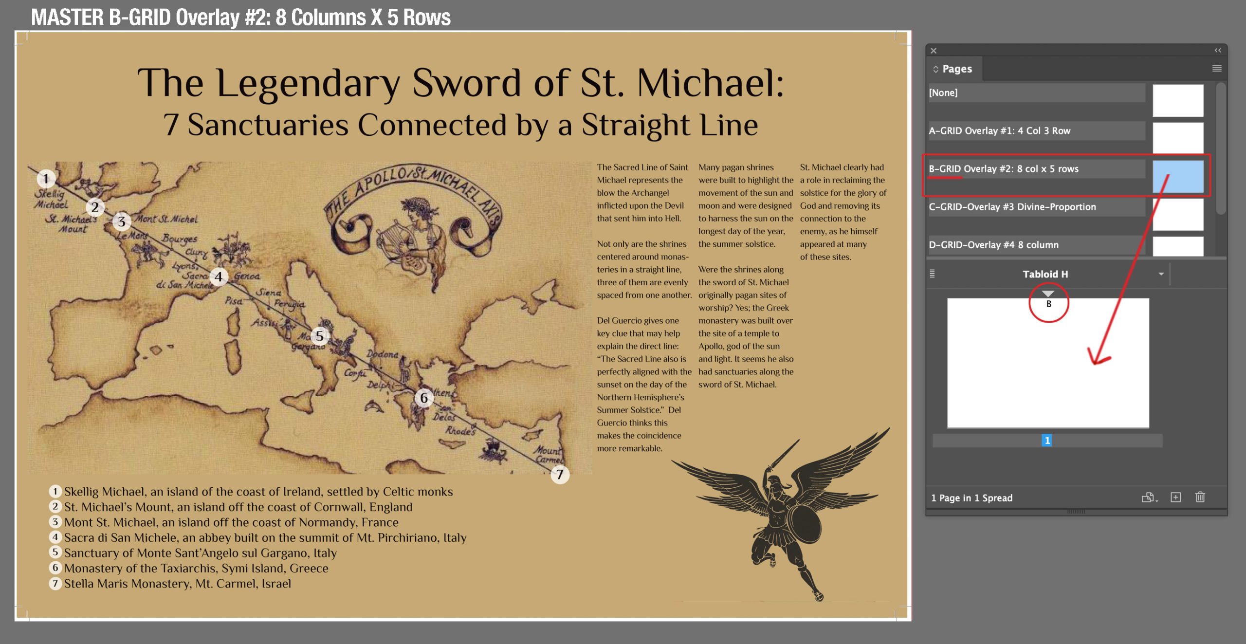
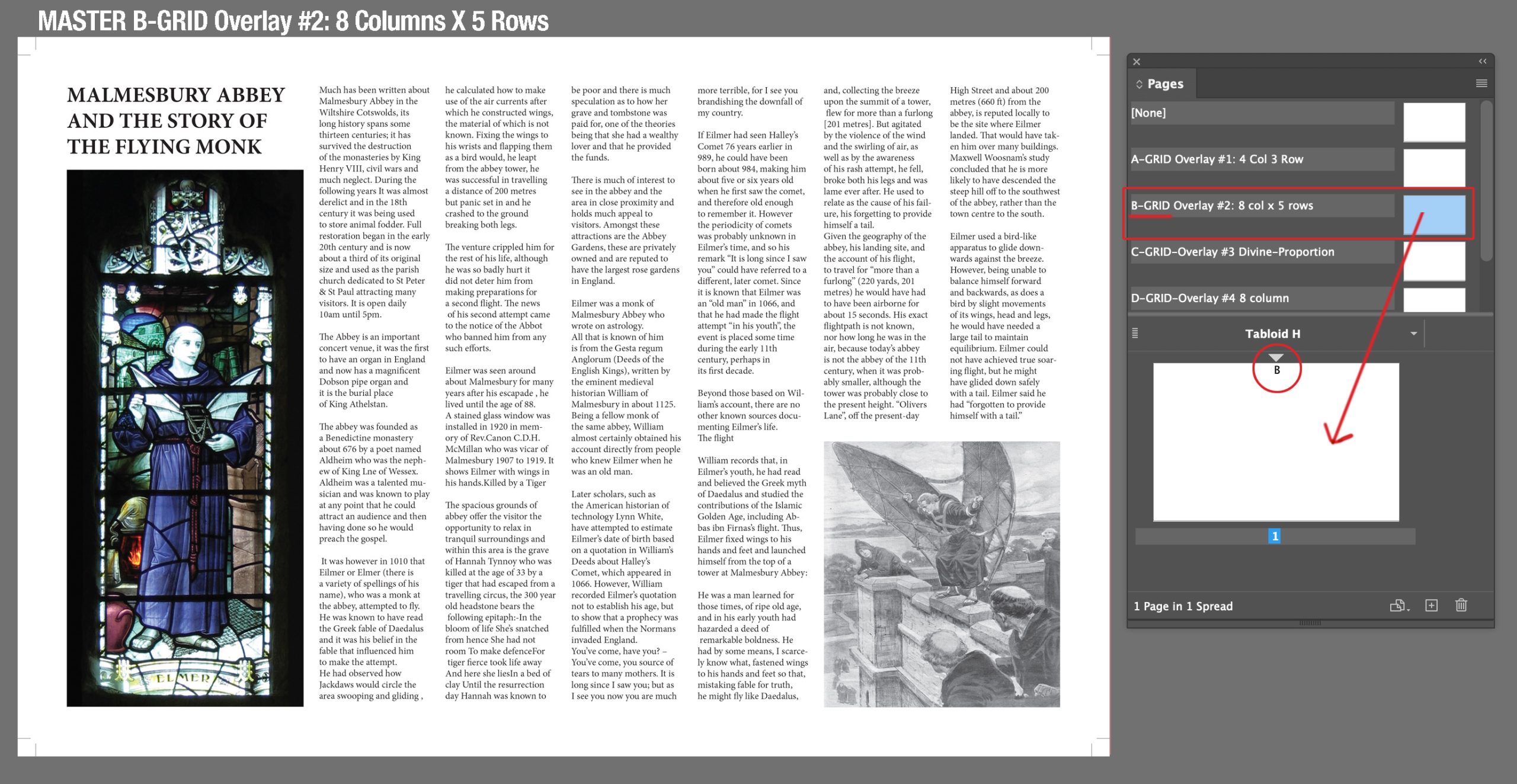
Grid B: 8 Columns, 5 Rows
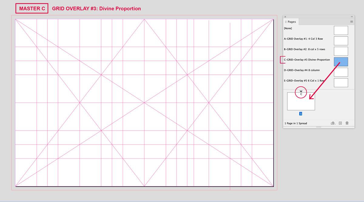
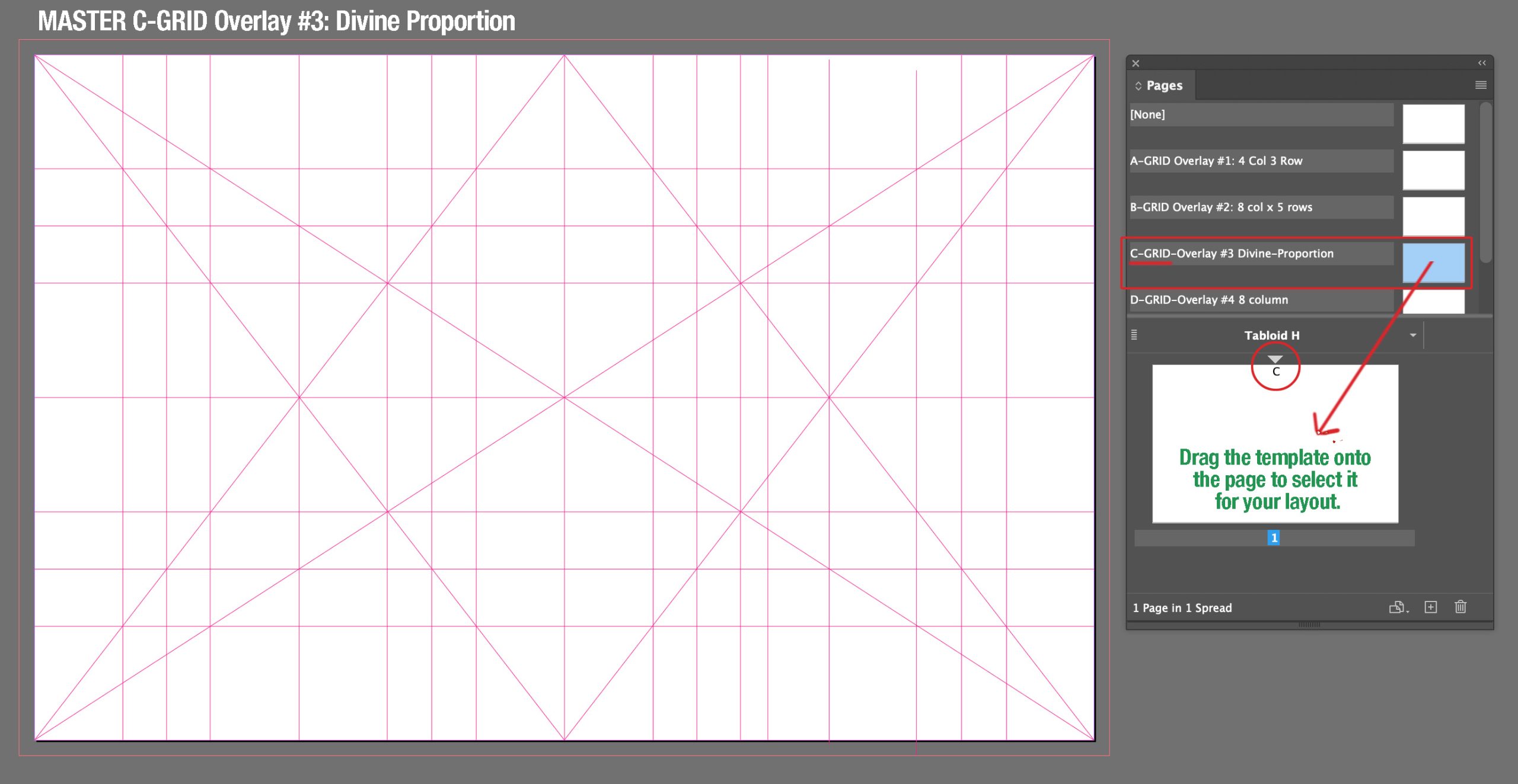
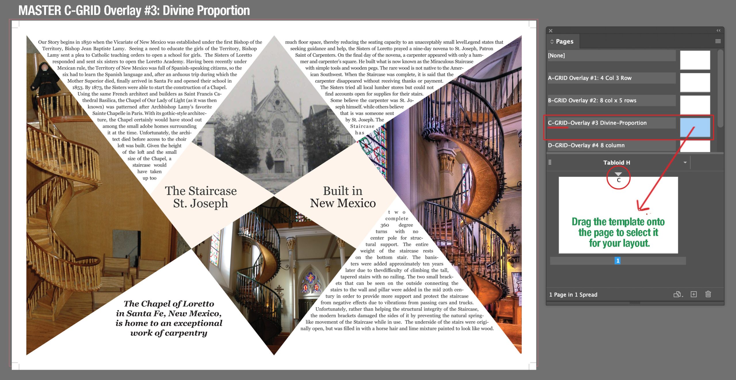
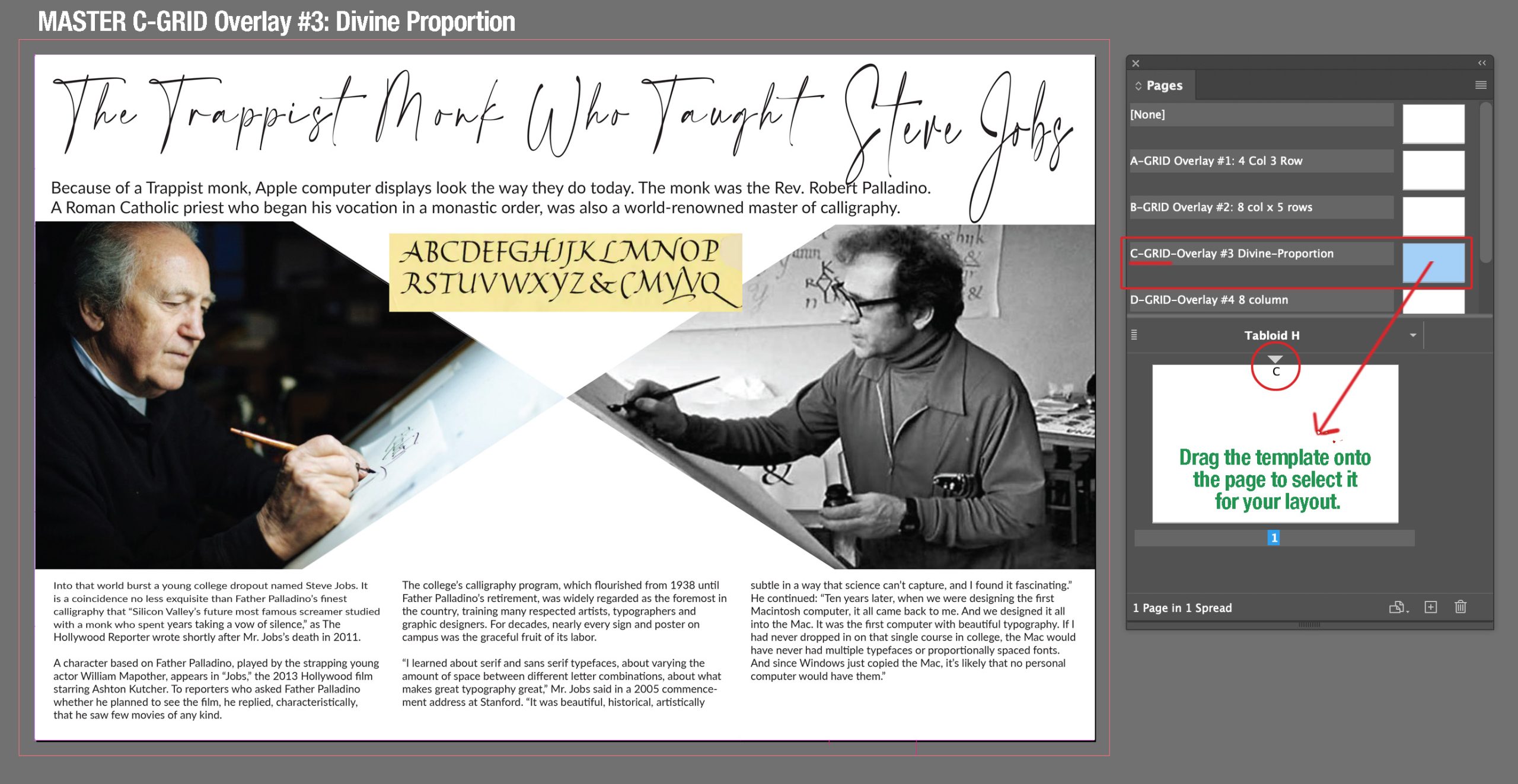
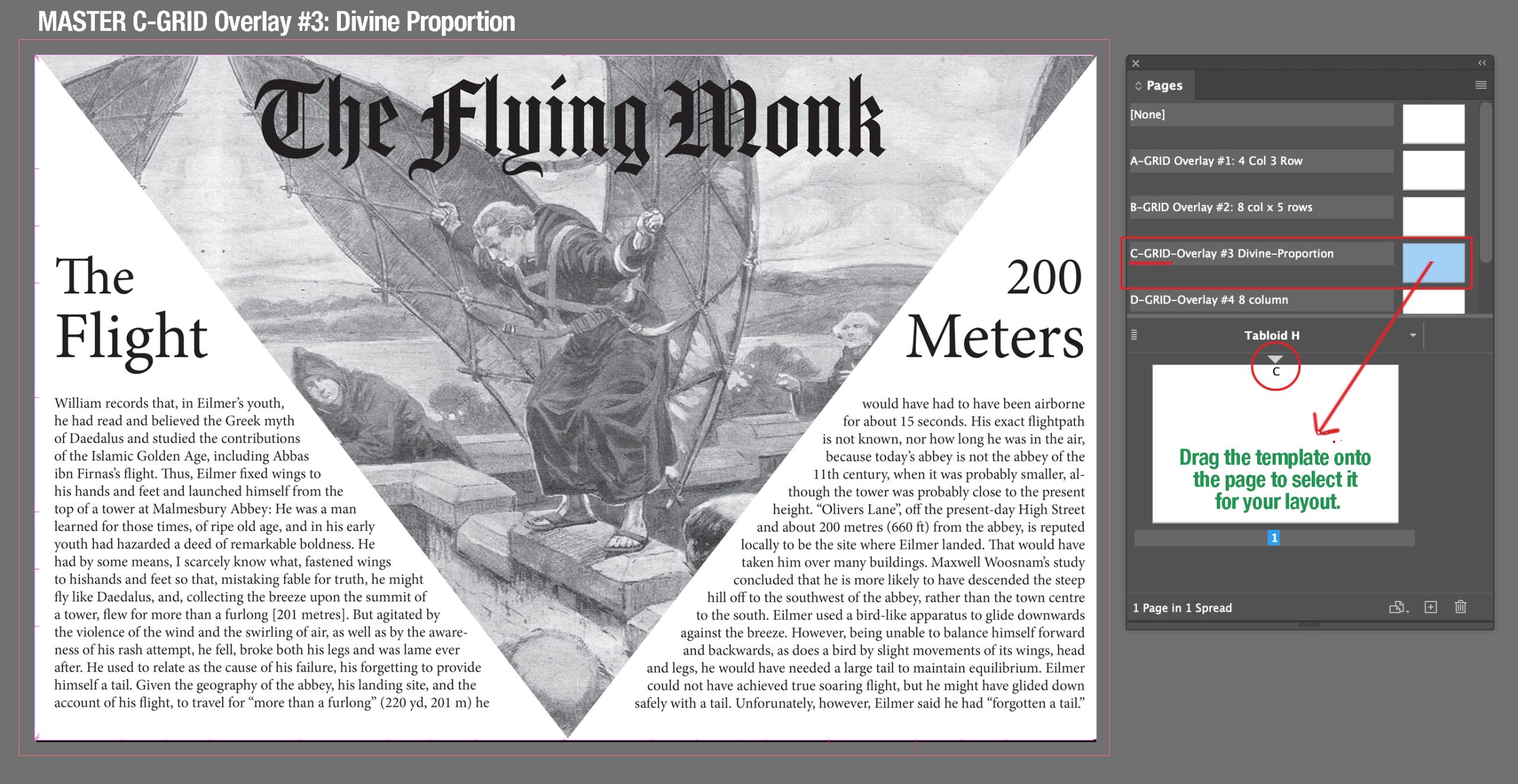
Grid C: Divine Proportion
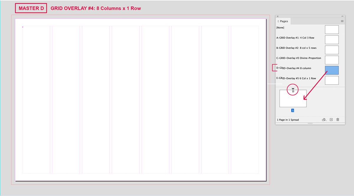
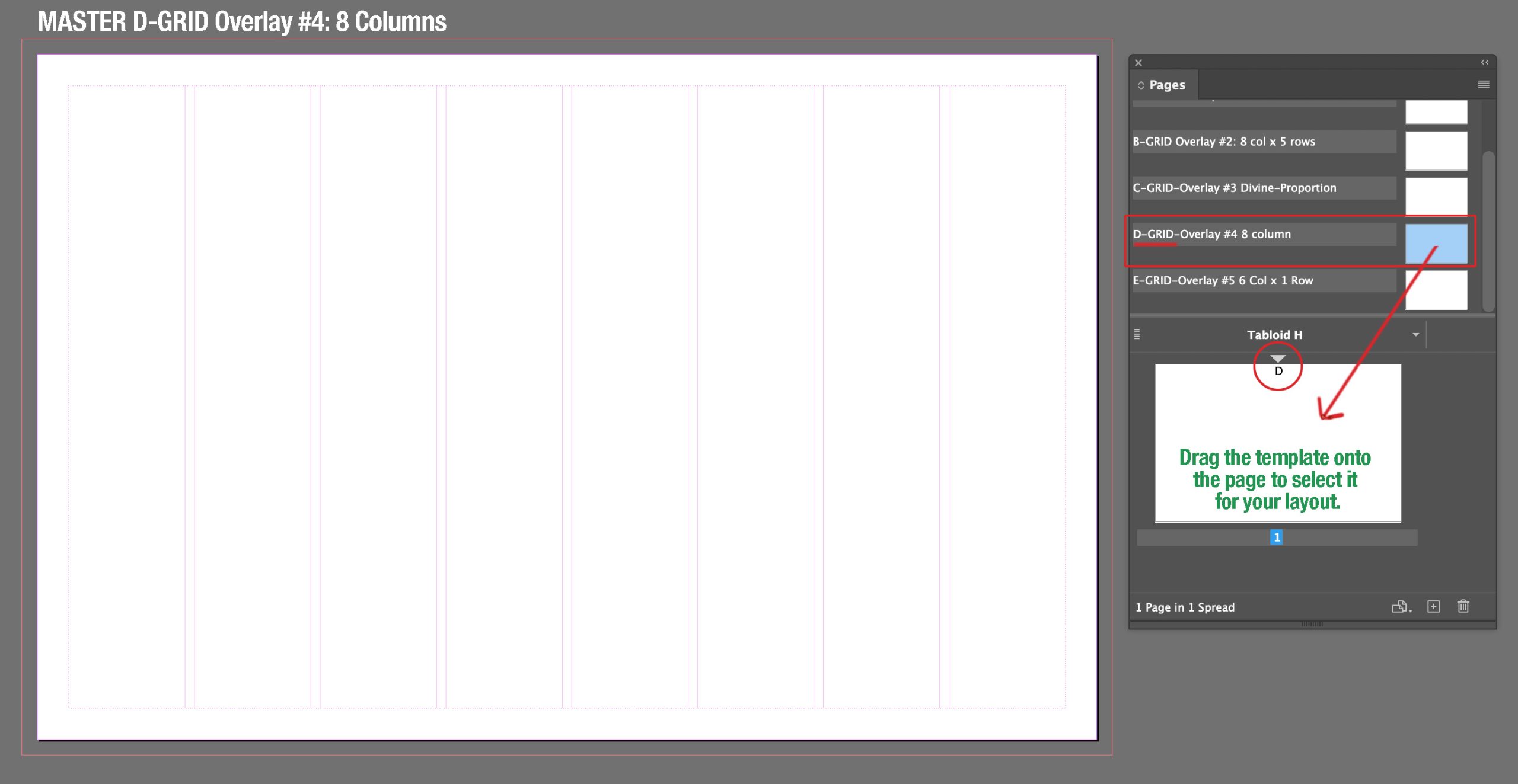
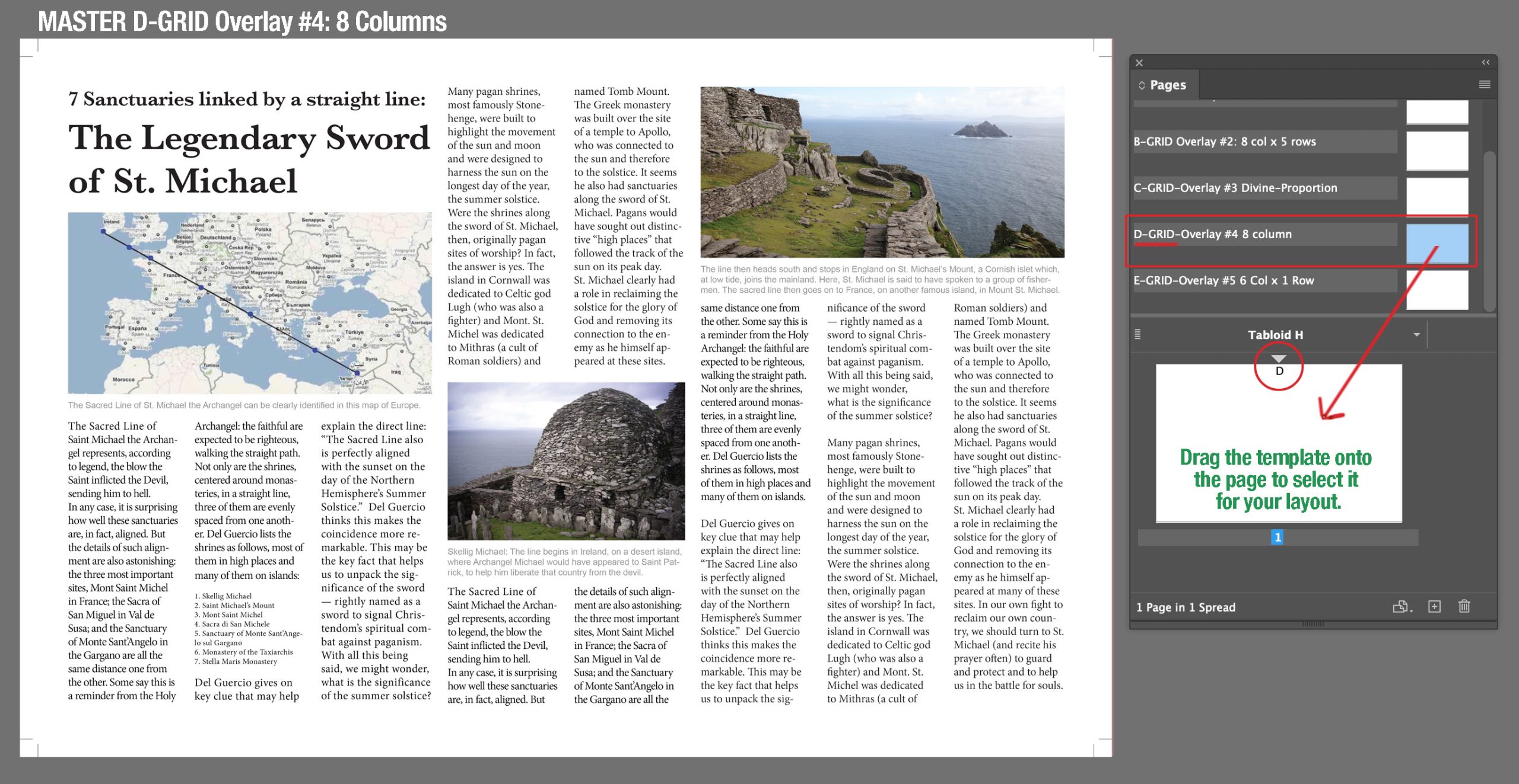
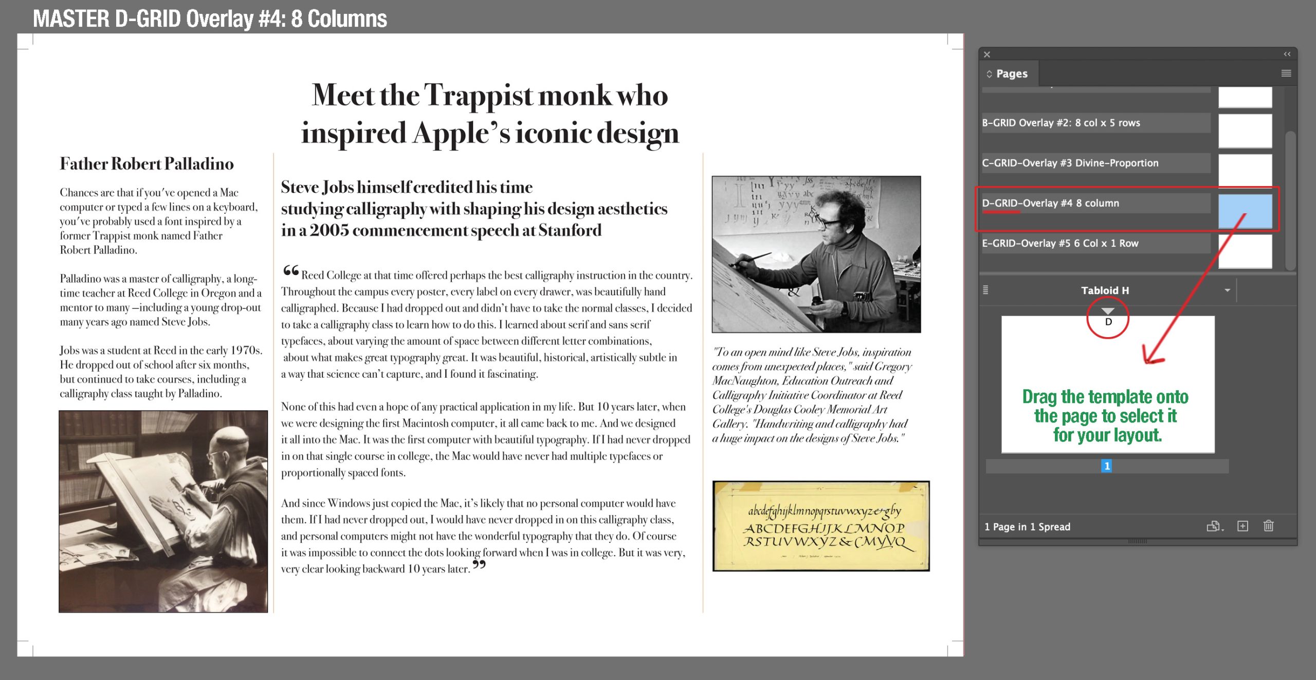
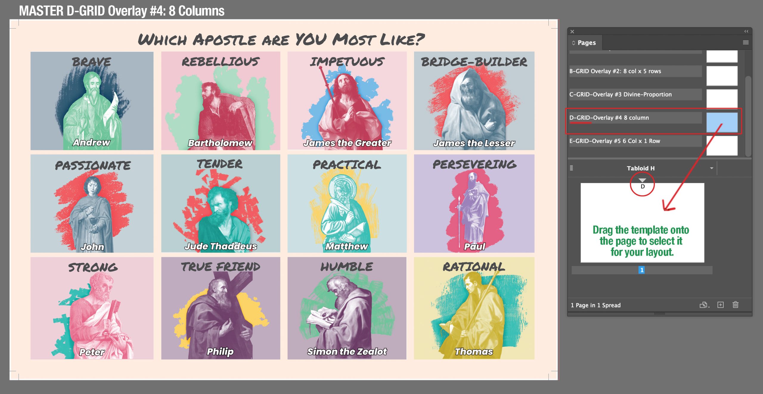
Grid D: 8 Columns, 1 Row
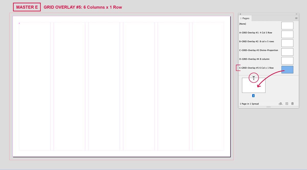
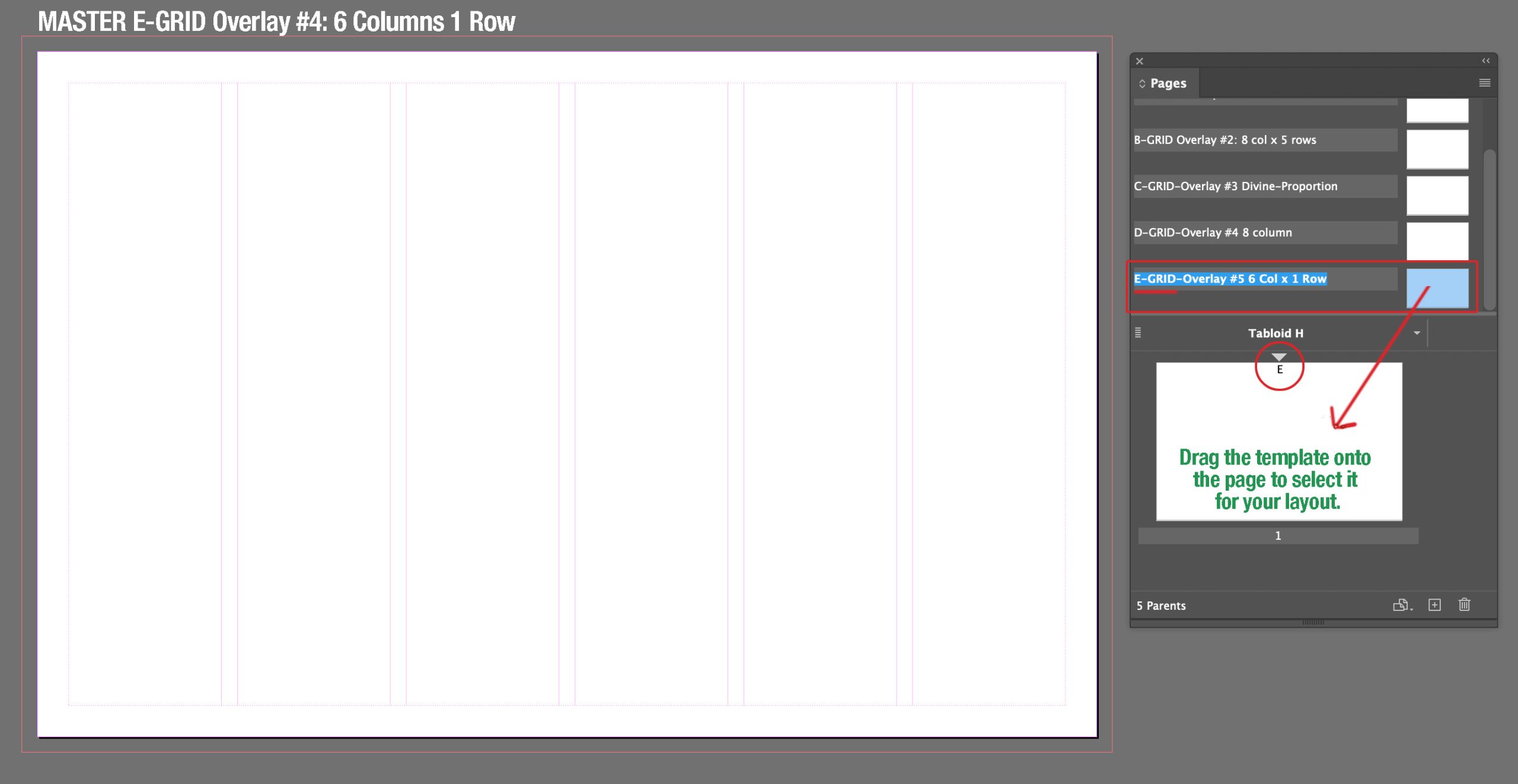
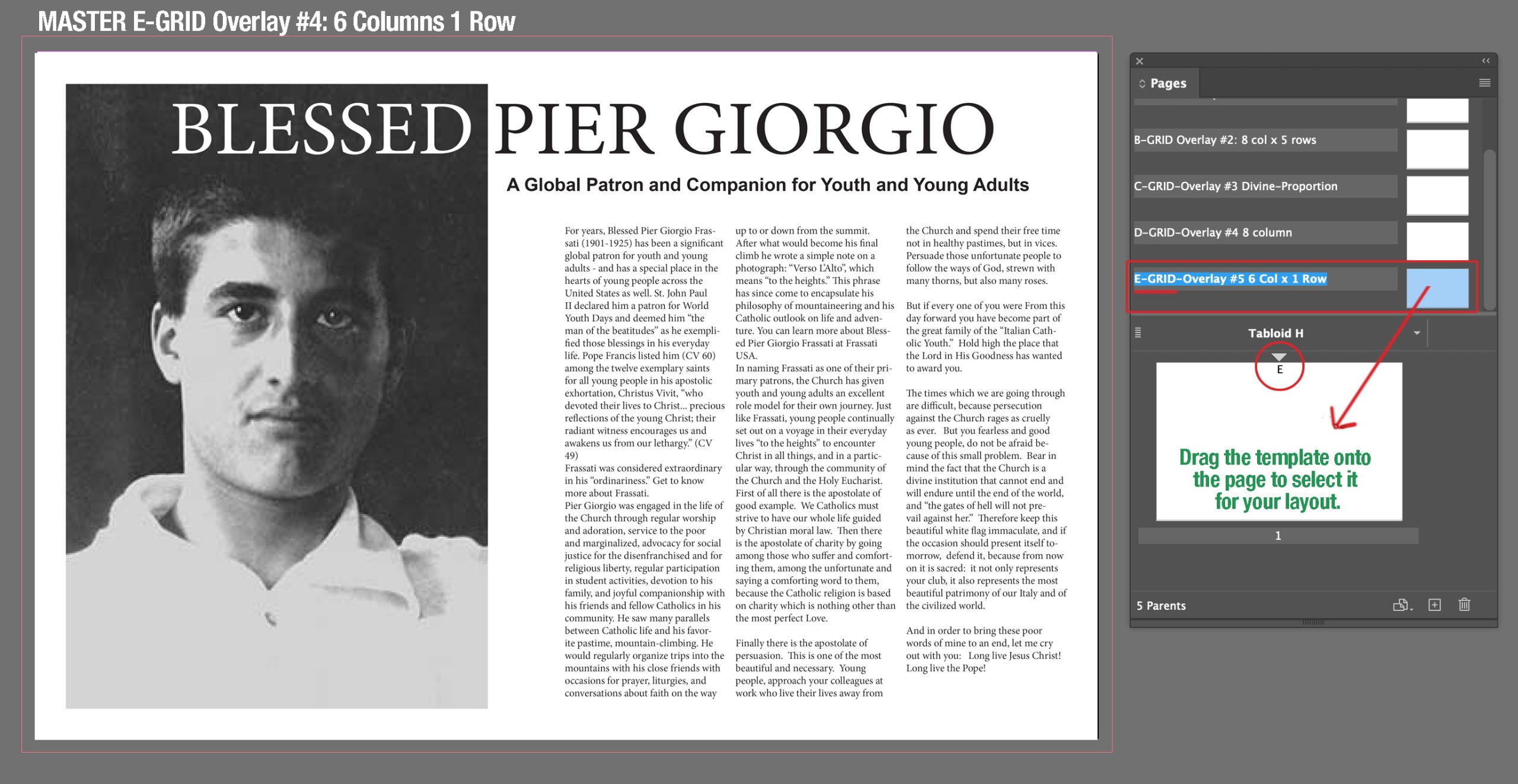
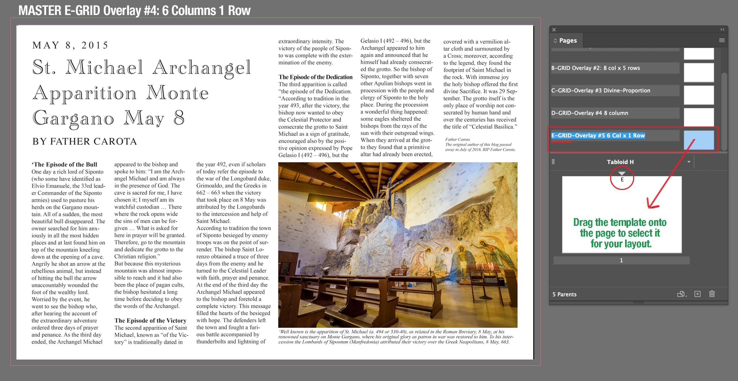
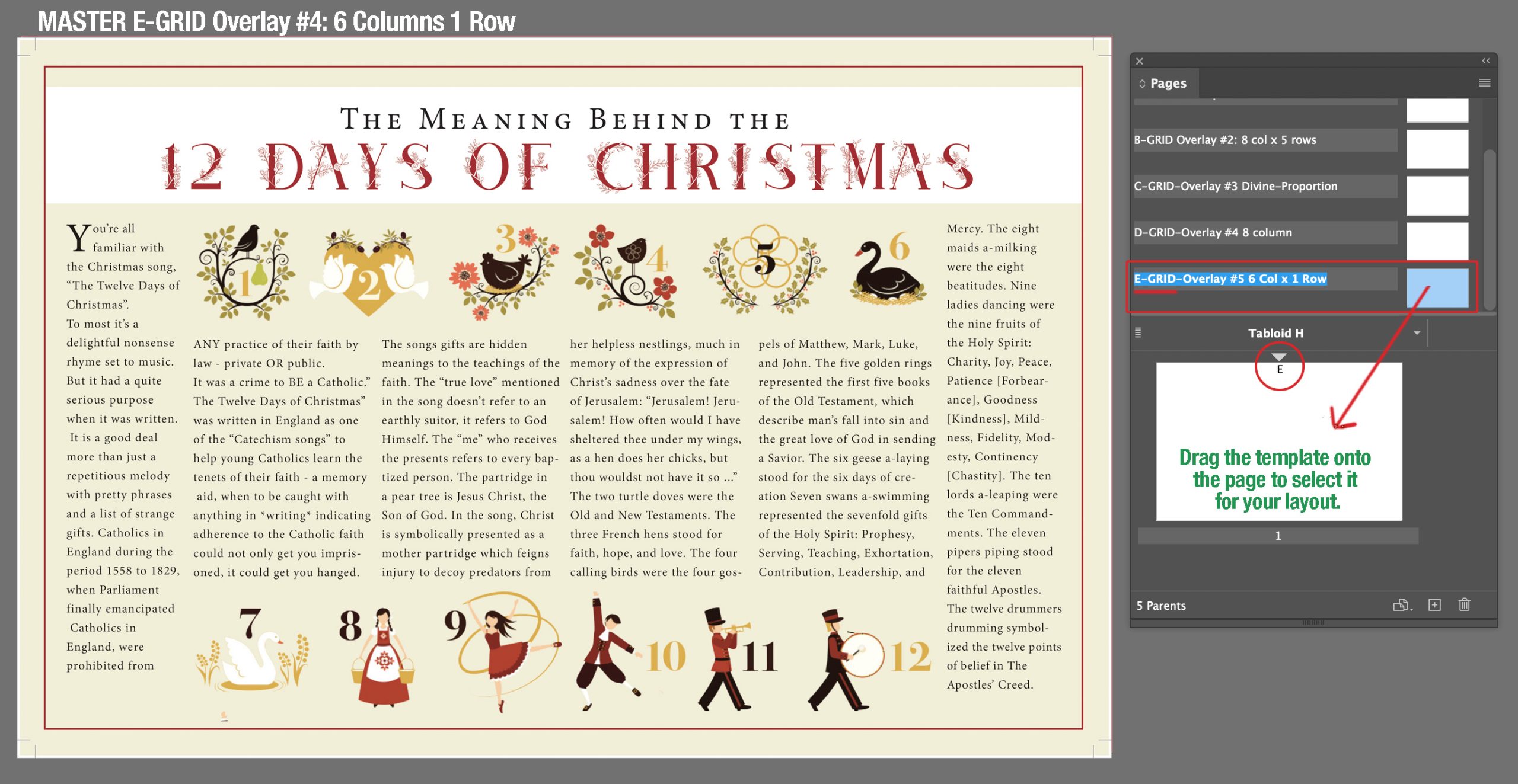
Grid E: 6 Columns, 1 Row
Typography Help: Review Top Notch Typography
TopNotchTypographyHere is a helpful video on layout & composition.