Scroll through the slides in this photo gallery below for how to either layer your text
or chop and colorize text to make your portrait.
There are examples of each type that you can see in this walk through of the two styles.
Tutorial on how to slice text and colorize letterforms
to render your portrait.
Creating a portrait with Illustrator is a time consuming technique but not too difficult to learn.
There are 2 videos below that walk you through chopping up type and using the distort tools and the pathfinder menu.
None of these videos have sound.
Tips & Pointers
We will be using Illustrator for this project.
(NOT PHOTOSHOP).
FYI: Here is a guide to see if your reference image resolution will work well for this project.
18×24 image @ 300 dpi =
5400 x 7200 dpi
300 is for print resolution
The poster must have .25″ bleeds on it.
___________________________
18×24 image @ 150 dpi =
2700x 3600 dpi
150 is suitable for some types of digital printing (check with your printer before hand)
___________________________
18×24 image @ 72 dpi =
1296x 1728 dpi
72 dpi is for web use only.
___________________________
You can distort text to fit into the image area:
Object > Envelope Distort > Make with Mesh
Two design strategies to consider:
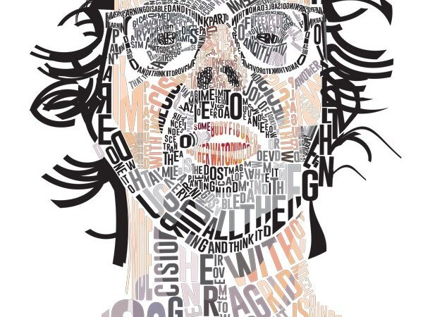
1) Layering text to create value on a monochromatic image.
2) Colorizing text and chopping up the letterforms using the underlying image as the color.
What you would need :
• Base image which you would like to convert to a typographic portrait.
• Adobe Illustrator
• Patience
• Creativity
Tips for Using a Black & White Portrait for Reference:
Choose an image which has good contrast between subject and background.
If you choose a color image, convert it to a black and white image in Photoshop and then import that image into your background layer in Illustrator and lock it – label it Reference. Converting the image to grayscale helps in understanding the shades of the subject in a better way.
Tips for Using a Color Portrait for Reference:
• Bold, Heavy, Extended San-Serif type works really well when using a color portrait.
• Convert text to outlines and slice the letter forms where color transitions in the underlying photograph.
Use the eye dropper tool to color the fill created by the new shape area.
Tips for Working with Type in Your Illustration
• Experiment with different font sizes, different font colors etc.
Remember there is no right way to do this, there is just your way.
• Work with the Envelope Distort Warp feature on text or the Warp Grid.
• It is not always necessary to distort the text.
• Choosing the right fonts for a typographic project is essential.
You have to think about the style you are after and the message of the design.
• It is useful to plan the best way to arrange the text.
• Use thick fonts for bigger blocks of the design.
• Use thin, cursive fonts for smaller details (like lines around the eyes).
• Keep gaps between details to separate them .
• Don’t distort the text too much, make sure it stays legible and looks good.
• Try to leave the least amount of negative space text needs to fit into.
• Create gradual transitions by leaving more negative space in areas where you have middle tones.
Student Work [2021 Spring]
Here is a link to some former student’s work from my professional website here.