1. The following information is required on food labels:
Ingredients: A statement of the ingredients
-
Serving sizeThe average amount of food that people typically eat
-
Nutrients
A list of nutrients, including total fat, trans fat, saturated fat, cholesterol, and sodium -
Percent daily value
Shows how much one serving contributes to the recommended total daily intake for each nutrient -
Calories
The number of calories per serving, expressed in increments of 5 for servings with 50 calories or less, and in increments of 10 for servings with over 50 calories -
Some information, like health claims and nutrient content claims, is voluntary.
-
Food labels must be easy to read, with letters that are at least 1/16 inch in height and contrast sufficiently with the background.
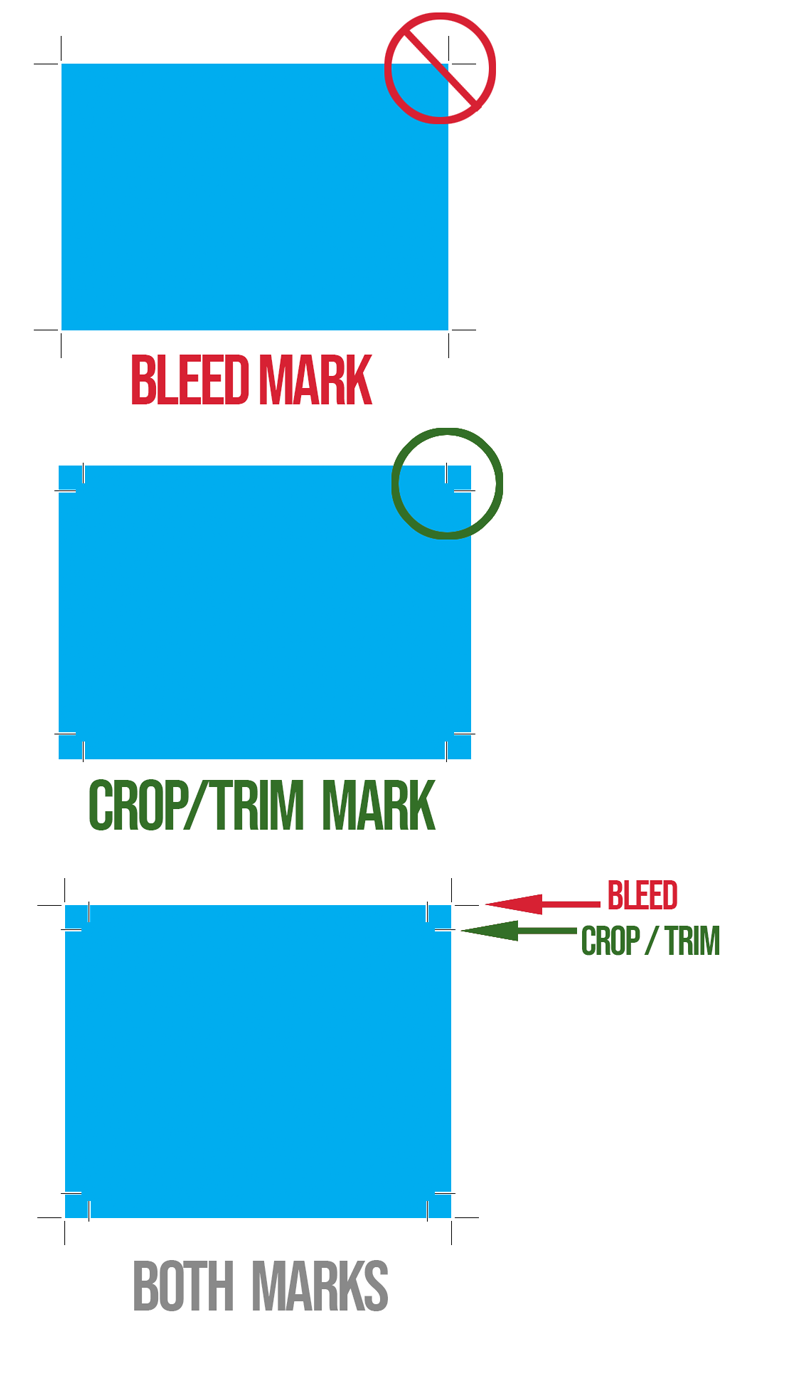
- Remember to put bleeds on rectangular, square or round labels.
Bleeds need to extend beyond the trim/crop marks. See a reminder illustration attached to this message. -
ALWAYS extend the artwork out to the RED line when using rectangular artboards.
When doing ROUND labels …
To create artwork for round labels, you can:-
Draw a CYAN (C=100, M=0, Y=0, K=0) circle (a.k.a. DIELINE) on a layer above your artwork and make the stroke .5 points—label the layer “Dieline” and lock it.Use the shape or ellipse tool to draw a circle on the document to represent the label’s printable area.
-
Label colors are normally white, so if your label has a color background (in your case you don’t, but for future reference … you need to extend any color beyond the stroke of your dieline to create a bleed area.
-
Generally, labels are printed on pre-made stock where you will have to position the art within the already die-cut stock if you are printing them out yourself. When you are using a printer, they will have the dies, and if you are ordering them online, most of the online printers only required the artwork without the dielines and when you upload the art their software places the art in the center. Sometimes there are ways to adjust the size of the art in these programs.
-
-
- Design your artwork: Within the circle, add elements like text, images, logos, graphics, and background colors. (again background colors require a bleed area that extends beyond (outside) the dieline.
- Consider the safe zone: Make sure your design elements are within the safe zone, which is the space inside the cutting limits. The safe zone means a MARGIN or white space around your subject. You don’t want your art to be right next to where the label is being cut.
- Set the resolution: Set the document’s resolution to at least 300 dots per inch (DPI) for high-quality printing.
- Proof and adjust: Before finalizing, check the design layout and text.
Remember if you are doing the outer packaging for the product (i.e. boxes) you also must have the nutritional content on your boxes!
————————-
2. IF YOU ARE DOING A NON-FOOD ITEM: For example … cosmetics you need to include the ingredients. There would be no need for the nutritional contents since you aren’t eating it … (hopefully not!) unless it is edible makeup???
- Name of Product: What’s inside the box?
- Net quantity: The net weight or other quantity of contents
- Name and address: The name and address of the manufacturer, packer, or distributor
- Ingredients: A statement of the ingredients
AND NOW MY RANT …
I shouldn’t have to explain about bleeds all the time. In Packaging the DIELINE is the TRIM, so all your artwork MUST extend BEYOND the stroke of the dieline … Think about it … you need to have some tolerance for when the die slices the cardboard, otherwise your color won’t go to the edge of your design … (see the attached reminder).You must understand these procedures before you graduate and go into the real world so you will know what you are doing technically to get the job done properly. This information will put you above most students who are graduating as they are not always taught how to prepare their files so that they actually can be produced!!!Graphic Designers must master these skills to control the quality of your end product.If you don’t care about the end product of your work, then no one else will.
I care about the end product of all my student’s work and you certainly should—if not, why bother wasting your precious time designing something mediocre that can’t be printed?
You are in control of the VISION OF YOUR DESIGN … and you need to know how things work after you pass it into the hands of printers and manufacturers, Your responsibility for your work doesn’t end when you upload a pdf …
Neglecting to do learn and pay attention to technical requirements in all your work, shows printers, and your client that you don’t care about your work. That you will settle for mediocrity. There is enough mediocre design in the world to go around.
You are spending enough of your precious time on creating designs, give it the respect it deserves 🙂
“BECAUSE I CARE …”For your viewing pleasure … attached are a few reminders from prior presentations and also an example of a round label design …