The Restaurant Project
Design a “themed” set of branded collaterals for a fictitious restaurant. Create a color scheme to build continuity throughout the design components that include:
1] company name
2] logo
3] brand identity board
4] menu
5] business card
6] letterhead
7] mailing envelope
8] business stationery mock-up
9] Yelp phone advertisement mock-up
I. NAME + LOGO DESIGN
Create a name for your restaurant and a logo for a restaurant that features an animal of some kind. For the logo use the Gestalt principles of psychology as applied to graphic design. Consider using the golden ratio to develop the icon. The Gestalt principles are used in real world logos every day and are some of the most reliable tools a logo designer can possess.
CLICK HERE: GRAPHIC TRANSLATIONS + TUTORIALS TO HOW TO USE THE GOLDEN RATIO IN DESIGNING LOGOS
https://virtuartcity.com/gestalt-in-design/
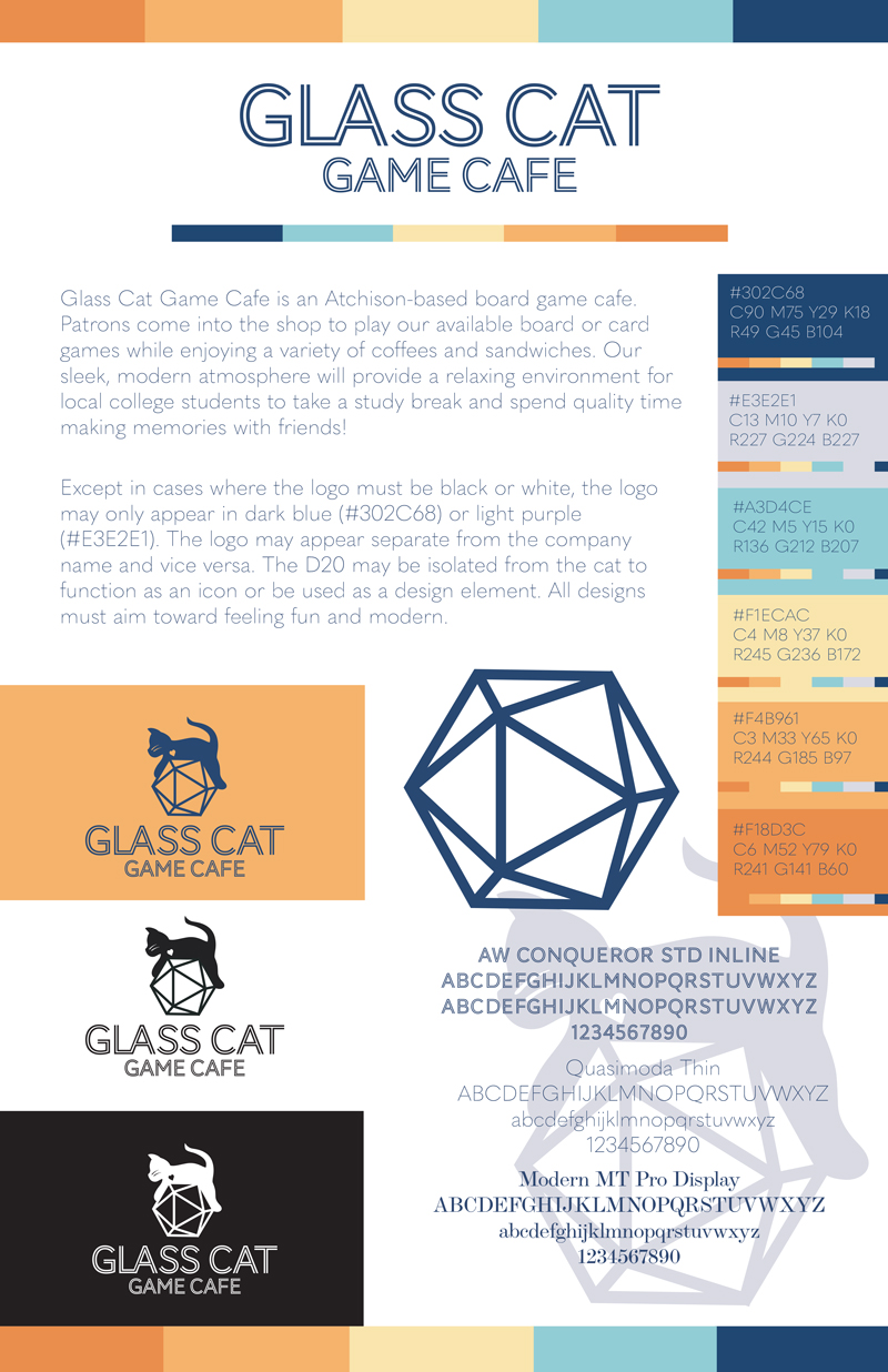
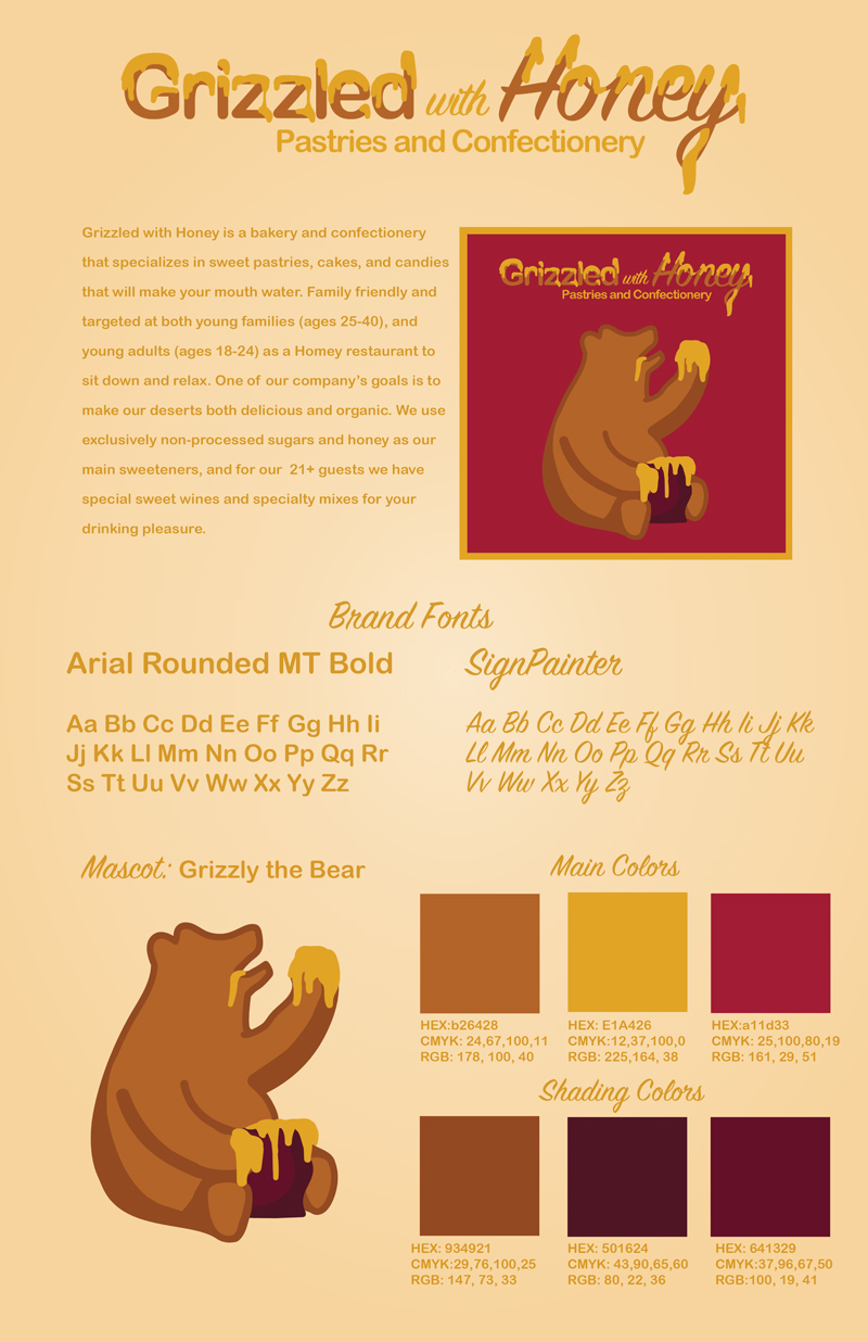
II. BRAND PRESENTATION BOARD
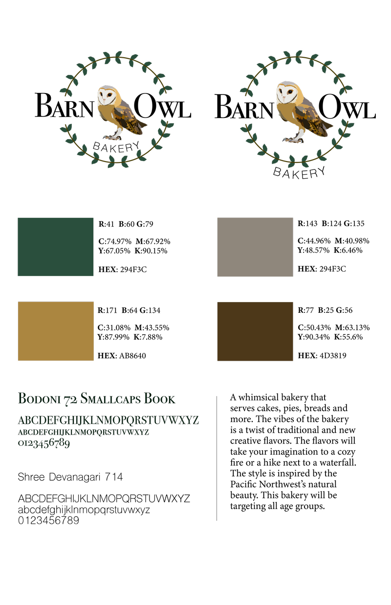
Create a Brand Board on an 11″ x 17″ page o present and communicate the brand strategy for your restaurant. Include a color palate for the branding along with selected fonts that will support the brand identity.
• Include the color scheme must indicate the RGB, and CMYK, and HEX values of each color in the brand identity.
• Present your logo and specifications for use.
• Include a Type Specimen of the fonts selected for the company brand. Your type specimen should include Alpha Numeric characters including Caps and Lowercase characters. There are some fonts that don’t have lower case or numbers.
• Include any Tag Line on your board: a tagline is a slogan or brand positioning statement about the company or product.
• Include a statement about your Target Market (i.e. type of restaurant)
TYPES OF RESTAURANTS
• Fine Dining
• Casual Dining
• Fast Casual
• Virtual Restaurant
• Family-Style
• Fast Food
• Food Truck, Cart or Stand
• Café
• Buffet Restaurant
• Pub
• Diner
• Bistro
 .
.  .
. 
Student Examples of Brand Boards
Student Brand Boards: 2023S
Notice that when the background printing goes to the edge of the paper, there is a .25″ extension of space beyond the trim position on the paper. This is called a bleed and gives cushion for the printer to trim the page to the final size. Notice that there are also printer’s marks on each corner of the document. These are called TRIM or CROP marks. Right now the nomenclature between Adobe Illustrator and InDesign is different, so you’ll want to pay attention to using the proper setting when you prepare your files for production.
BrandBoards-Restaurant-FINALS-2023S
III. DESIGN COMPONENTS: 4 TOTAL
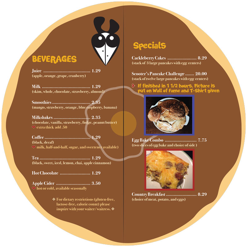
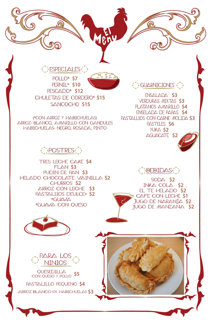
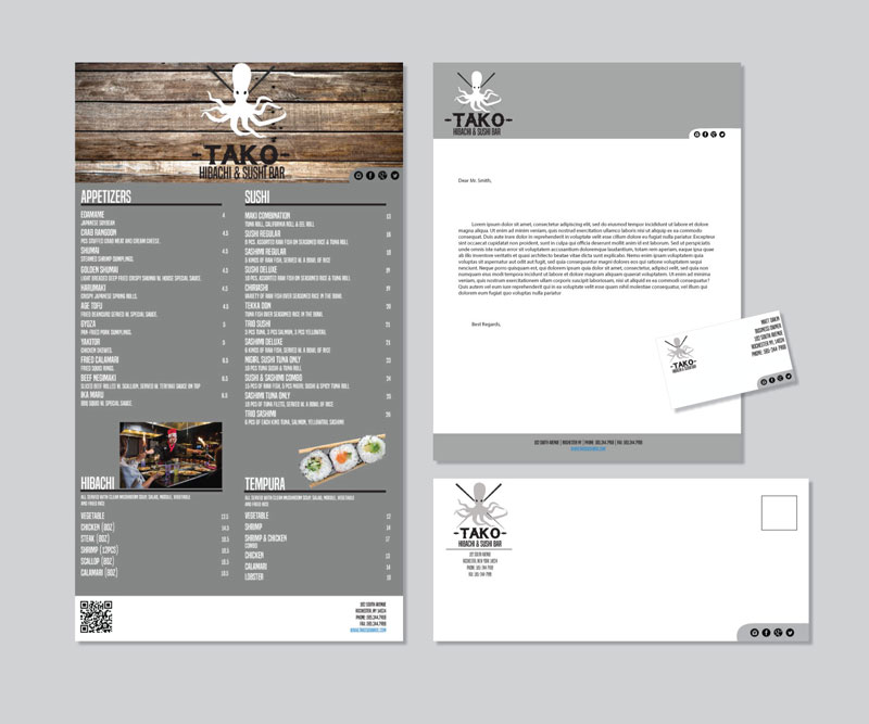
a. MENU
– design a one-page, single sided menu for your restaurant
– include names of dishes with descriptions and pricing
– Include your restaurant logo somewhere on the menu
– include at least one (1) high res photograph of food
– must be no larger than 11″ x 17″ (can have bleeds: Use .25″)
 .
. 
Click on each image to open in another tab to view larger.
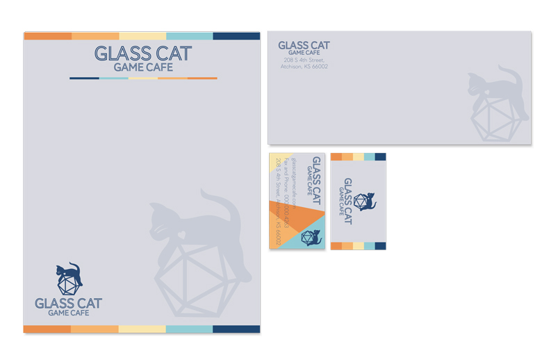
Student Menu Designs: 2023S
BUSINESS STATIONERY
b. BUSINESS CARD – one sided
– include the business logo
– business address
– telephone
– fax number
– website
– tag line (optional)
– size: 3.5″ wide by 2″ high (can have bleeds)
c. LETTERHEAD
– include the business logo
– address
– telephone and fax number
– website
– tag line (optional)
– size: 8.5″x 11″ (can have bleeds)
d. #10 ENVELOPE
– include the business logo
– address
– size: 4.125″ x 9.5″
 .
. 
Click on each image to open in another tab to view larger.
Student Work Business Stationery: 2023S
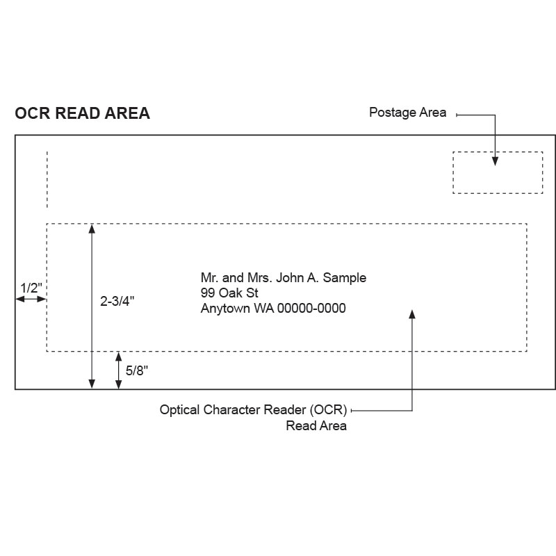
Postal Standards for Mailing
Proper Delivery Address Placement
On a letter-size piece, the entire delivery address should be within the Optical Character Reader (OCR) read area, which is defined as follows:
a. Left: 1/2″ from the left edge of the piece.
b. Right: 1/2″ from the right edge of the piece. (The Postal Service recommends 3/4″ because of lead edge fold over.)
c. Top: 2-3/4″ from the bottom edge of the piece.
d. Bottom: 5/8″ from the bottom edge of the piece.
Having the delivery address | within the OCR read area gives the Postal Service the best opportunity to read the address and to apply a correct routing barcode to the mail piece.
Proper Return Delivery Address Placement
The return address tells the Postal Service where the sender of a mail piece wants it returned if the Postal Service cannot deliver it. Place the return address in the upper-left corner of the address side of the mail piece or the upper-left corner of the addressing area. The requirements for a letter-size piece are as follows:
Left: 1/2″ from left edge of the piece
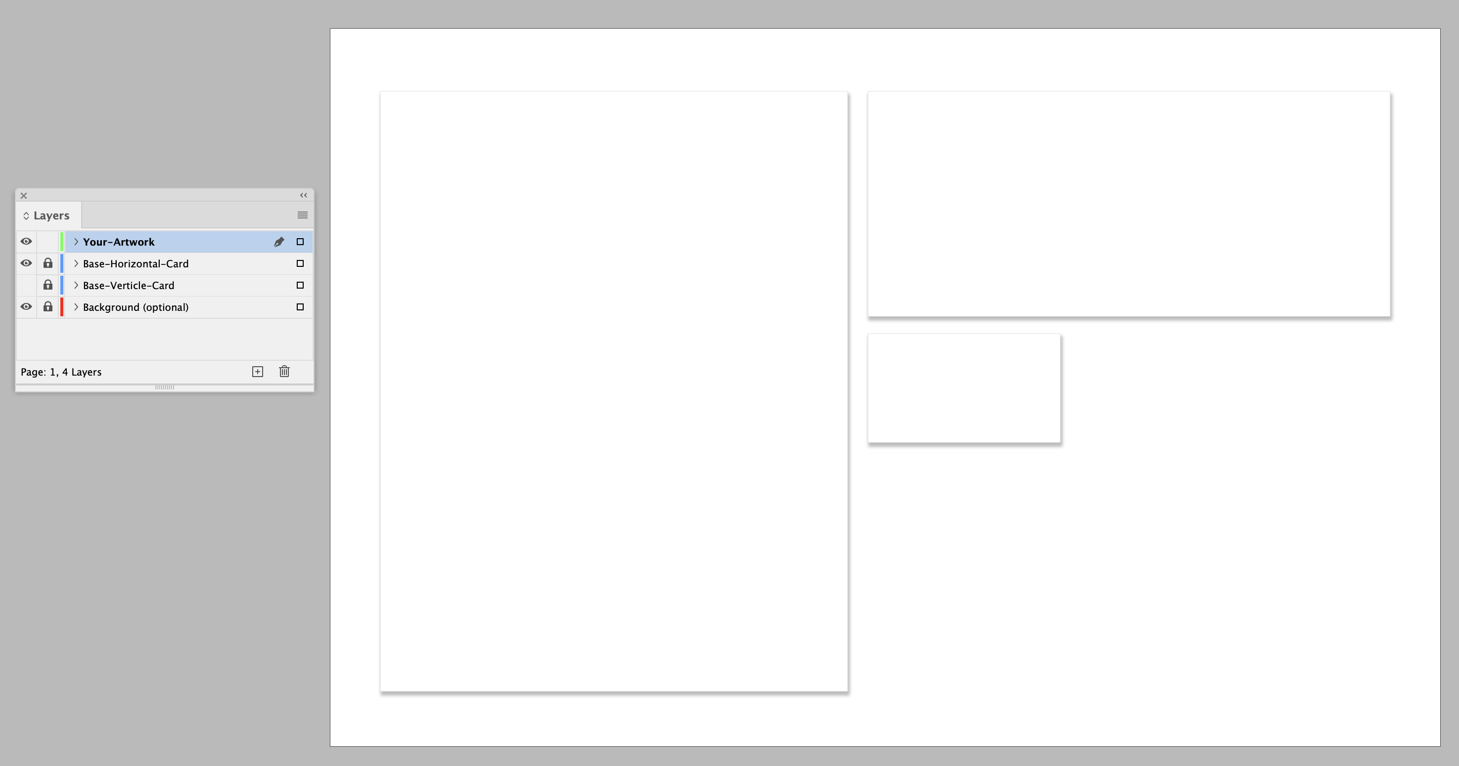
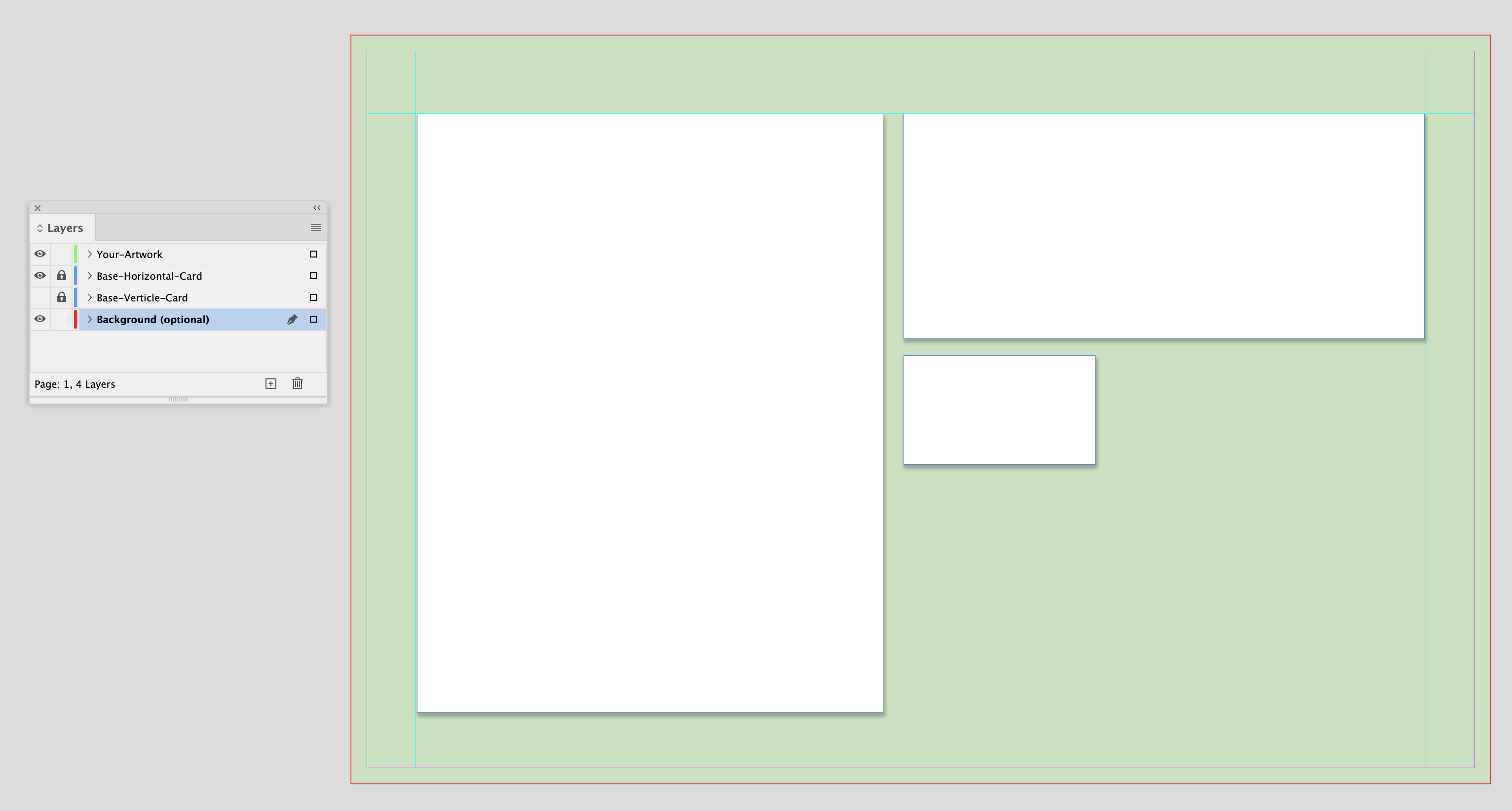
Stationery Template
Use the supplied stationery template. You will have to RESIZE our original files to fit on the template. The board is 11×17 and has a .25″ bleed so if you want to have a color background, you can accommodate that. There are placeholders on the template with a subtle drop shadow. This is so that if your stationery is on a white background it will stand out from the background. You also have an option to design a vertical business card or a horizontal one.
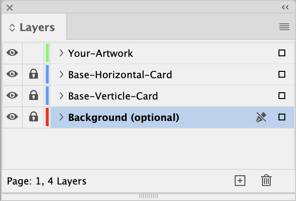
There are several layers set up in the file.
- Your Artwork
- Base-Horizontal Card
- Base-Vertical Card
- Background (optional)
Yelp Phone Adverts
Here are some samples of the Yelp Mock-ups.
SocialMedia-YelpAds_2024_web-1