Objective
To explore the forms of typography and translate them into an informational graphic that educates people about the subject matter.
Specifications / Requirements
Quantity: 3 Poster – a SERIES, so they need to relate to each other (see examples below).
Size: 11″x17″ Poster
Bleeds: .25″ on all four sides
You can orient the series horizontally [landscape] or vertically [portrait].
Use RICH BLACK otherwise known as PRINTER’s BLACK. This creates a richer looking black in the final print.
The formula for printers black is:
C=60, M=40, Y=40, K=100
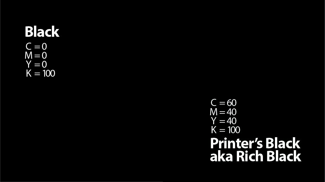
Note: Depending upon your monitor, you may note see the difference between Rich Black and 100% Black since you are viewing in digital space. However, there is a significance difference in the Blacks in the physical printing world.
Type Anatomy Poster
Design a poster series showing the anatomy of type to someone new to the subject. The main object of the poster is to show letter forms and their attributes to introduce terms and corresponding parts of the letterforms as clearly as possible in a creative and visually interesting way.
1. Working with a single typeface, or comparing up to three (3) typefaces, enlarge or reduce, cut out sections, or overlap parts — anything that helps explain the terms to the viewer.
Use a maximum of three (3) colors sparingly and soley to add emphasis on the anatomy.
For example, explanatory text could be in one color, and parts of the letterforms in another.
2. The explanatory copy can be taken from the references on typography that you can find on the internet.
3. The best way to do this project is to convert your main letterforms to outlines and utlize the pathfinder tool to slice the various elements of the letterform to identify it with a different color.
Student Examples
Resources
https://visme.co/blog/type-anatomy/